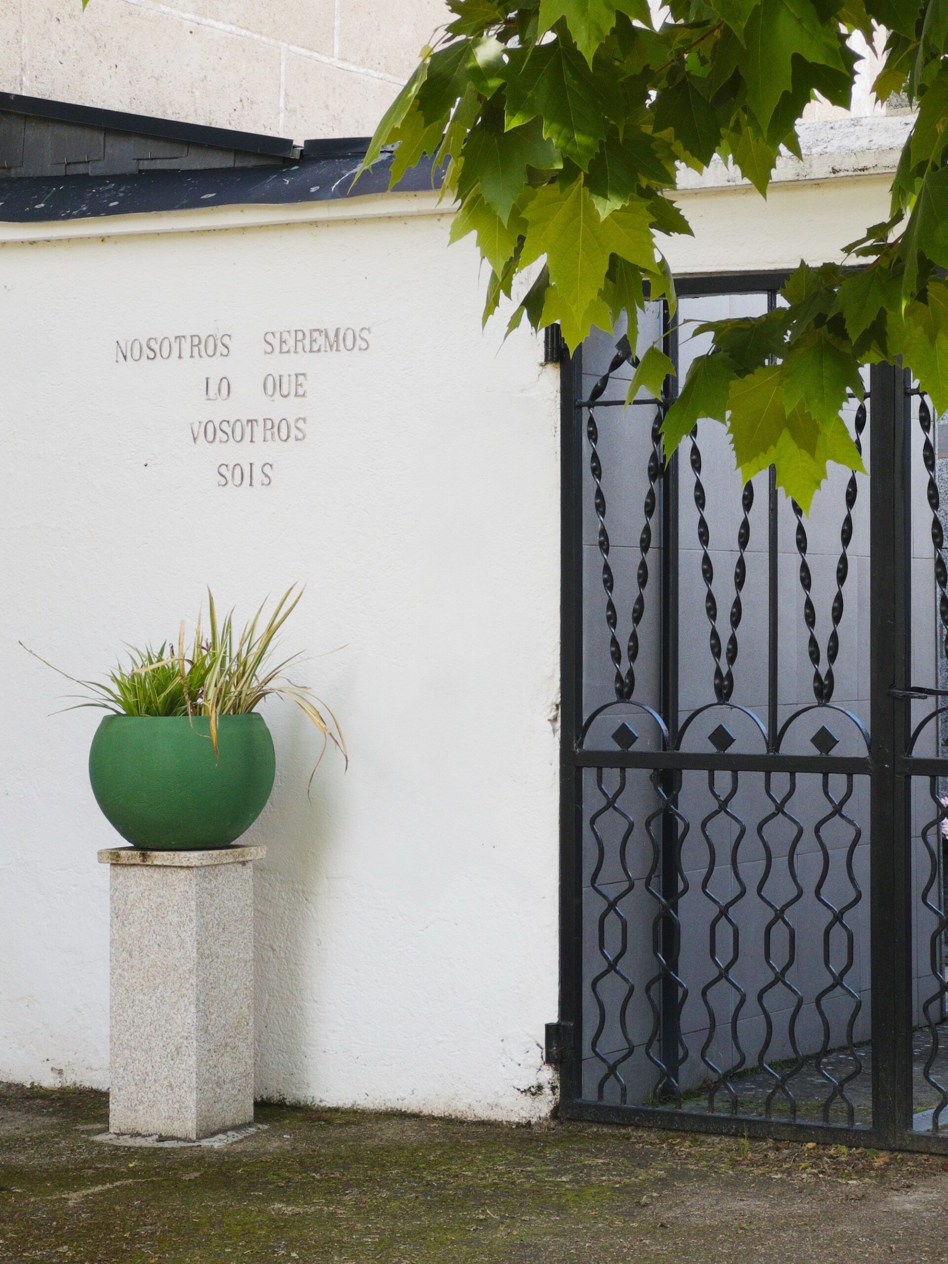
Andando pola terra, descubrín
paisaxes coma bosques, densos de humidade,
desertos dourados, sen fin,
e montes e vales ondulantes.
Os meus ollos enriqueceron.
Mais sobre todo, descubrín
as xentes desta terra,
os seus sorrisos e as súas esperanzas,
e que temos máis cousas en común
e que debemos romper as que nos dividen.
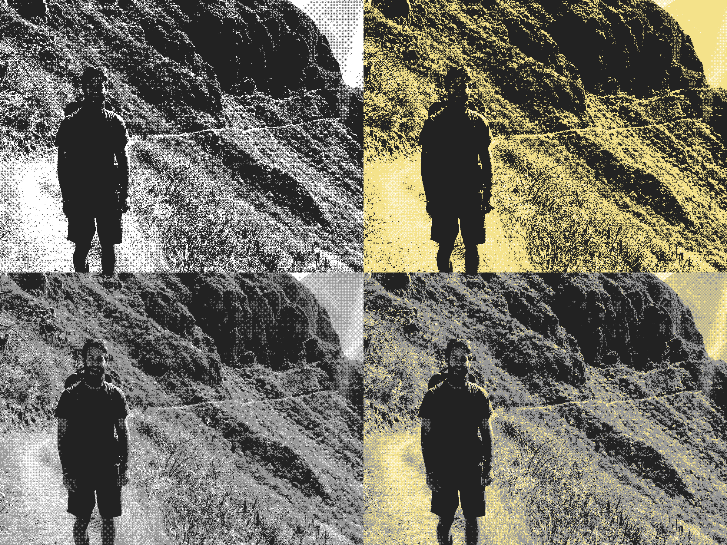
On the three versions of my about page, I’m running an experiment with dithering images using Bayer 8×8. I had an LLM make a tiny custom plugin for WordPress and the size results are below:
It’s not completely fair. The original image is a .jpg at 1600×1200 pixels and the dithered versions are .png files downscaled to 1200×900. I might try making them .webp files. The colors are black #222222, gray #999999, yellow #F4E28A, and white #FFFFFF.
I’m not sure which one I’ll stick with and if I’ll opt to dither all images going forward or not. Adding gray allows more facial details in the first photo from Colca Canyon in Peru. The pure black and white feels like a DIY zine.
I’ve treated this page as an Instagram alternative to share some of my photos. But I’d honestly prefer to make this place more into a place of writing; adding a photo every six months or so isn’t really what I want to use this for. Maybe dithering images will persuade me to describe more with words rather than a random photo here and there. Which version do you like better? Comment below.
I do have an audio project that I’d like to start soon which combines language, WordPress, and podcasting together here, along with a participatory element. That should be ready to go in the summer.
Update: I also tried one with black, gray, and white, which is possibly my favorite.
Clockwise from upper left: black and white; black, yellow, and white; black, gray, and white; black, gray, yellow, and white.
You spent 22,629 minutes reading 12,427 articles in 2025. We estimate that puts you in the top 5% of Wikipedia readers globally. The average person reads 335 articles a year.
Yeah, I’m a fan. But my plan for next year is more emphasis on books and my to-be-read stack (actually six, which I’ll write about some other time, maybe).